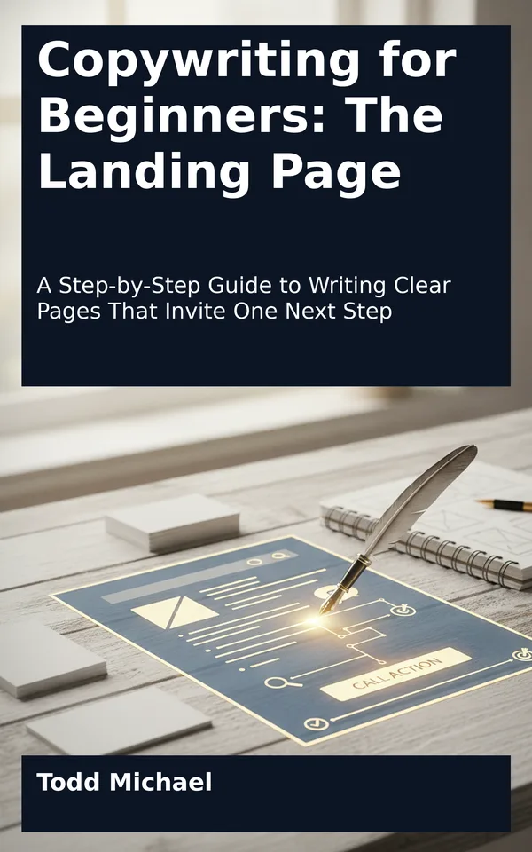
Read a sample: 1. What a Landing Page Is Supposed to Do
A visitor arrives on a page because something caught their attention. Maybe a friend sent a link, a search result seemed relevant, or a short message described a problem they recognize. Now the visitor has a few immediate questions: Am I in the right place? What is this offering? What can I do here?
A landing page helps answer those questions and invites the visitor to take one particular next step. That step might be requesting a consultation, signing up for a workshop, downloading a guide, or purchasing a product. The action depends on the offer and on what a reader can reasonably be ready to do.
For a beginning copywriter, that focus is useful. You do not have to explain everything a business does or persuade everyone who might ever visit. Your job is to help a defined group of readers understand a specific offer well enough to decide whether to take the next step.
That does not mean leaving out information that might make someone hesitate. A useful landing page gives readers enough context to make a considered choice. It answers relevant questions, makes the action clear, and lets the wrong-fit reader recognize that the offer is not for them. Good copy supports a decision; it does not need to corner the reader into one.
Think of a landing page as a conversation with a purpose. The page begins with a reader who has arrived from somewhere and has a reason, however tentative, for looking. It introduces an offer that may be relevant to that reason. Then it shows the reader what to do if they want to continue.
Three elements shape that conversation:
- The reader: the person the page is intended to help, along with their situation and questions.
- The offer: the product, service, resource, or experience being presented.
- The next step: the specific action the reader can take from the page.
These elements work together. If one is unclear, the others become harder to write.
Imagine a page that says, “Make your workday easier.” That may sound appealing, but the reader cannot tell whether the page is for a manager, a baker, a student, or someone else. Nor do they know whether “easier” refers to software, coaching, a checklist, or a piece of equipment. Even a prominent button will struggle to clarify a message that has not yet explained itself.
Now consider a more focused opening:
> A practical planning session for freelance designers who want to organize an overloaded project calendar.
This sentence does not complete the page, but it gives the reader a direction. It identifies a group, names a situation, and describes the kind of offer. The visitor can begin to judge whether the rest of the page deserves their attention.
The distinction matters because a landing page is not simply a page with a button on it. It is a page whose content has been selected and arranged to support a particular decision. The headline, explanation, supporting details, and action prompt should all contribute to that decision.
A general website page often serves several purposes at once. A homepage, for example, may introduce a business, point visitors toward multiple services, share recent news, and provide routes to an about page or contact form. That breadth can be useful when people arrive with different interests.
A landing page is usually narrower. It may be part of a larger website, but its copy concentrates on one offer and one primary action. A business that offers photography, design, and writing services might use its homepage to introduce all three. A landing page for a beginner photography workshop would concentrate on the workshop: who it is for, what it covers, and how to register.
The difference is not necessarily visual. A landing page can be short or long, plain or elaborate, part of a large site or published on its own. It can include a navigation menu, images, and links to useful supporting information. What makes it focused is the role of those elements. They should help the intended reader understand and evaluate the offer rather than compete for attention with unrelated requests.
For example, a workshop page might link to accessibility information because that detail could help someone decide whether they can attend. That link serves the page’s purpose. A prominent invitation to browse an unrelated collection of services may pull the reader into a different decision before the workshop has been explained.
You do not need to remove every possible exit or hide information to create focus. A reader may need to check a policy, contact the business with a question, or leave and return later. Focus means being deliberate about the main path through the page, not pretending readers have no other needs.
The phrase “one next step” can sound stricter than it is. It does not mean a page can contain only one button or that a reader can take no other action. It means the page has one primary action: the action its main copy is written to support.
A page inviting readers to register for a workshop might have a registration button near the top and another after the workshop details. Both buttons lead to the same primary action. A contact link for accessibility questions can also have a legitimate supporting role.
The page becomes less focused if it gives equal prominence to several unrelated requests: register…